Role
UX/UI Designer
Time
2023
Platform
Website (redesign)
Tools
Figma, Figjam, Google forms
Overview
Adamanta, the largest climbing gym operator in Mexico with 4 gyms as of 2023 (and with a couple more scheduled to open in 2024), owes its growth philosophy to their ability to build and nurture a strong culture of local community. They’re also known for having “modern-style” facilities, which have attracted many climbers, both newcomers and the experienced, to their gyms and have popularised the sport of climbing in Mexico.
For this project, I wanted to explore Adamanta’s potential growth areas and improve the online experience from a UX/UI design perspective.
[This project was a case-study as part of a UX/UI bootcamp with Designlab.]
Problem
While Adamanta is known for its culture of community and boasts some of the best climbing gym facilities in Mexico, their current website doesn’t accurately reflect the quality of experience found in their gyms.
Solution
A redesigned adamanta.mx website and an improved online experience that focuses on creating a welcoming experience for newcomers.
Updated visuals to reflect Adamanta’s core brand
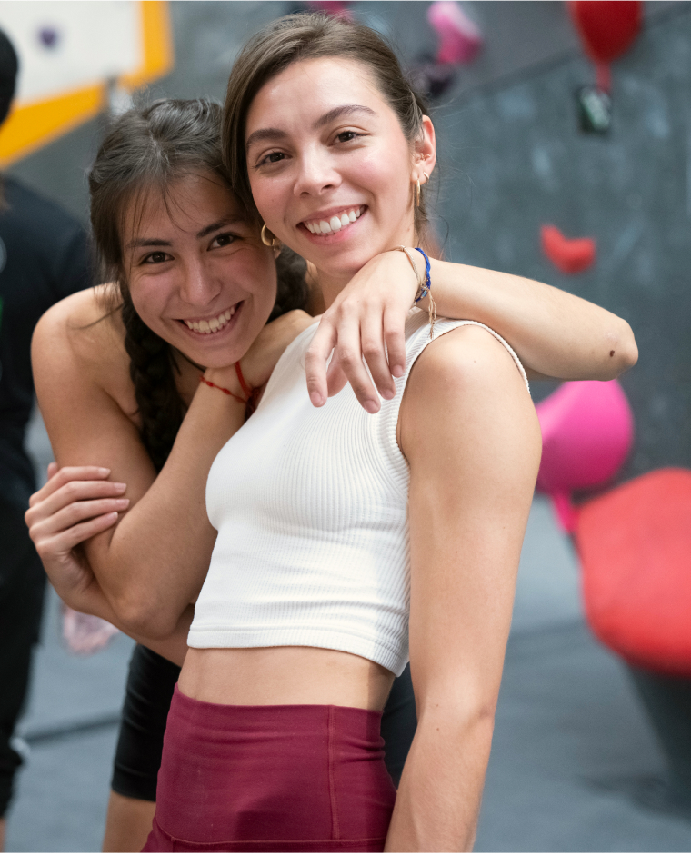
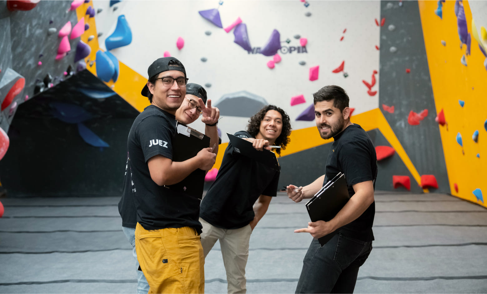
Part of the business goals to attract more people to Adamanta’s gyms, particularly those new to climbing, and to represent their core image of an inclusive community, the visuals and copy were updated to cater to the target audience.
Guide newcomers with a positive first impression
User profiles (new climbers, experienced climbers, and kids) in the first visit page address specific informational needs of visitors to Adamanta’s website and created a positive first impression similar to the in-person experience when you walk into an Adamanta gym.
Dedicated location pages with relevant details
Specific page for each Adamanta gym location with relevant details such as pricing, events calendar, facilities, and staff details.
RESEARCH
Research goal
After the initial project kick-off meeting with Adamanta, the purpose of the project was defined to redesign the website in order to accurately inform and to attract prospective clients to one of their gyms. Therefore, the research goal was to discover what people new to climbing or those searching for a climbing gym look for and what their process is when deciding on a climbing gym.
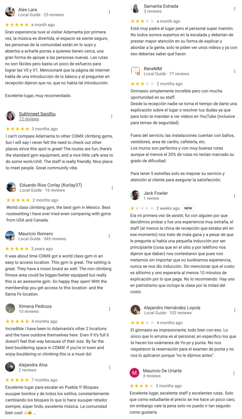
Google reviews
Highly-rated reviews across all 4 Adamanta locations
✅ Great community and atmosphere (friendly staff, cool vibes, excellent choice of music).
 The first step was to look into the google reviews of each Adamanta location to discover common positive and negative themes. On average, Adamanta’s gyms had a 4.8/5 rating.
 World-class modern facilities, high quality route-setting, new routes each week and for all levels.
 Website mentions an introduction for people new to climbing, but reviews mentioned clients were told there were no introduction when they went to the gym.
 Poor first experience among predominately among newcomers to the gym and expectations of safety protocols, client service, and introduction to the gym from the front reception staff.
Google analytics
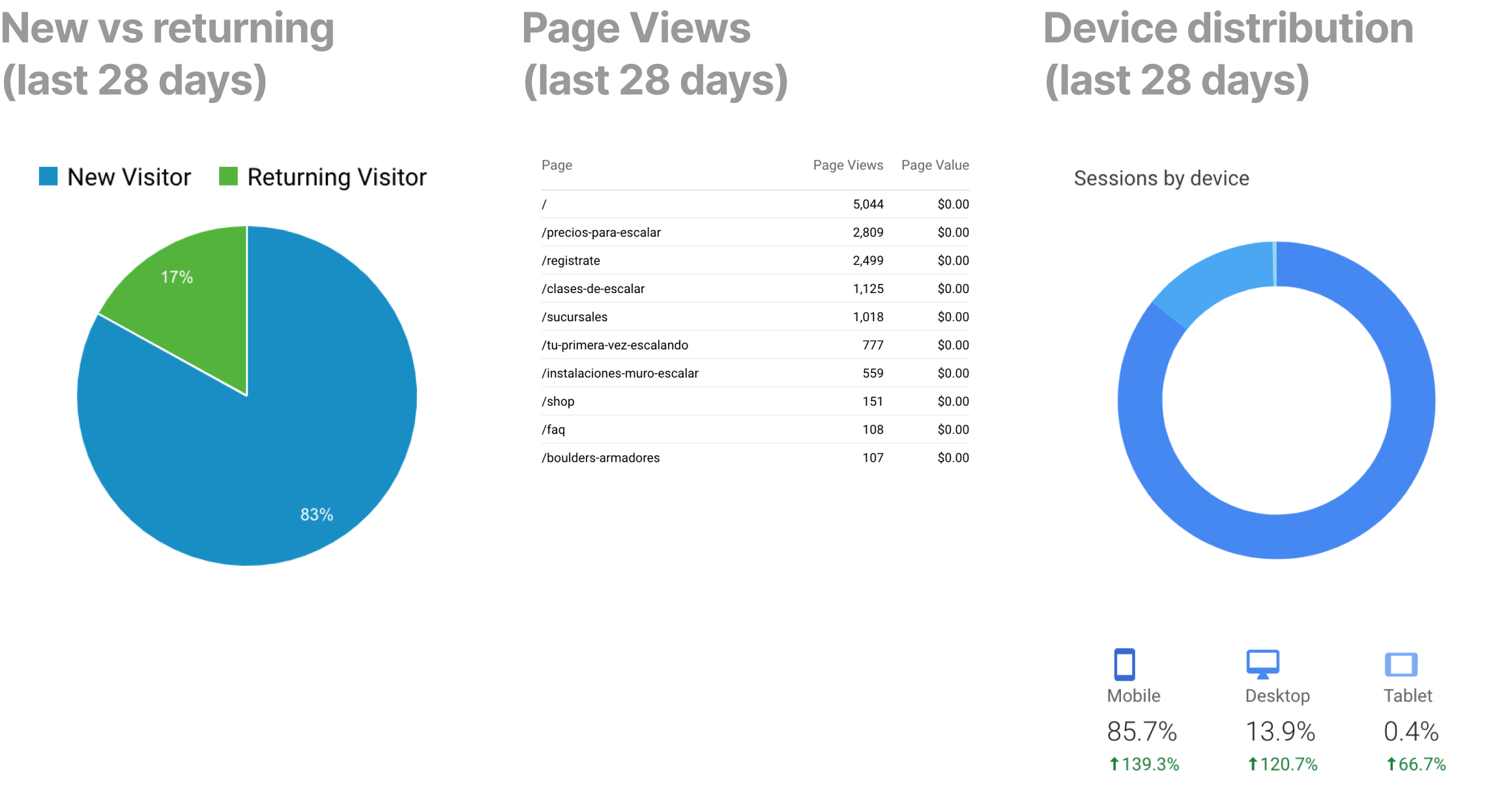
Majority of users are new visitors
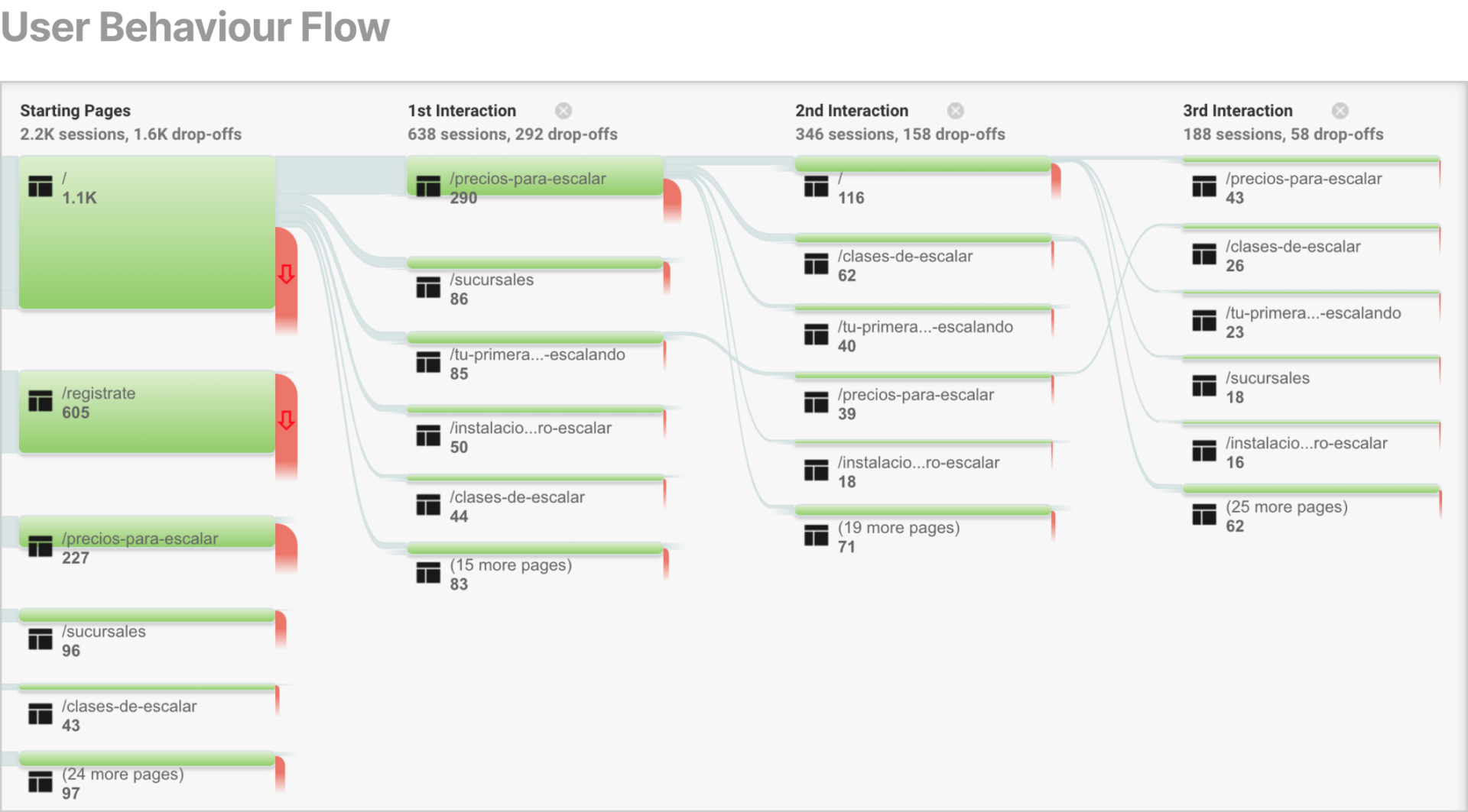
Existing Google analytics data were analysed to discover patterns in user engagement that could give insights to the research process.
The majority of users found to be new visitors to the site, making 83% of total visits.
The most common pages users frequented after the landing page were pricing, location, and first visit.
85.7% of users view adamanta.mx on a mobile device - this percentage may not truly reflect the number of authentic device visits because of how the current induction process where newcomers must scan a QR code with their phone and fill out an electronic waiver upon arrival at the gym).
All data were taken on the 24th of March 2023. See complete data in Figma
Competitor analysis
Adamanta leads multi-location climbing gym concept in Mexico
It was important to understand the where Adamanta sat in the competitor landscape to understand trends, expectations, opportunities and competition.
While the US leads in the best indoor climbing gyms in the North American market with gym chains such as Movement, Central Rock Gym, and Touchstone, Adamanta might be the only multi-location climbing gym in Mexico. Both local climbing gyms in Mexico City and multi-location climbing gyms in North America were compared in the competitor analysis.
Key insights of the competitor analysis include:
All competitors use high quality images, with ‘Movement’ having the best selection of photos because they featured diverse range of people, particularly people new to indoor climbing and people enjoying themselves in a light-hearted manner.
Information structure and navigation differs between single and multi-location gyms, with multi-location gyms having dedicated websites per location.
Not all gyms showcase their community equally. ‘Movement’ uses a comprehensive calendar system, while small gyms use social media to post events.

Website evaluation
Existing website is not mobile-friendly
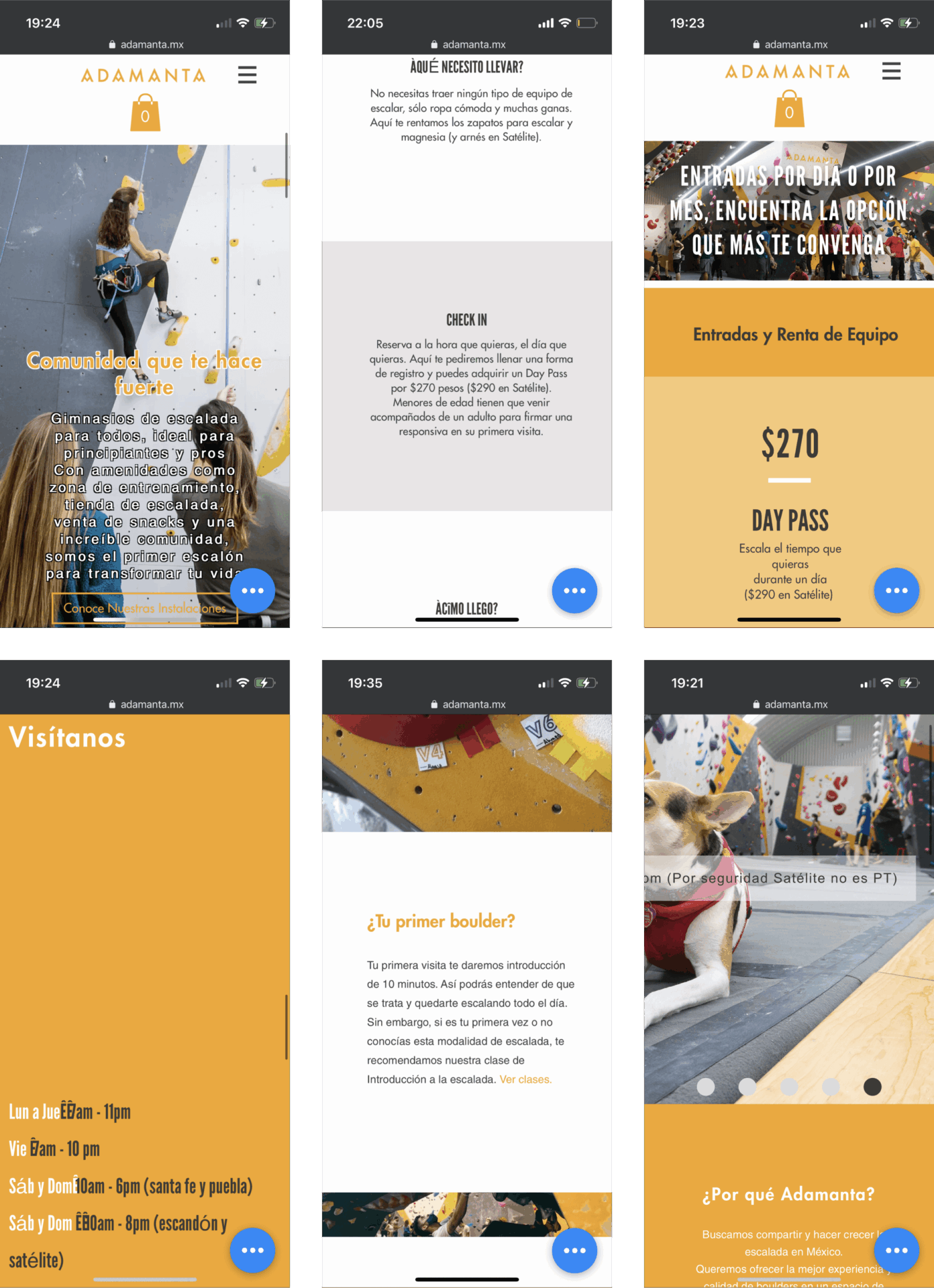
4 participants were asked to browse adamanta.mx for necessary information in order to go to an Adamanta location, give their general opinions, and their first impressions of the website.
Participants found parts of the website not functioning properly on mobile view (i.e. some text and images not displaying properly).
Participants found the first visit page informative. The website mentioned clients need to reserve their first visit, however there was no way to do so on the website.
Visuals helped to manage participants expectations of what the facilities were like and what the gym offered.
Some participants noted that some of the climbers on the website were intimidating.
Many participants looked at the prices page first, with one participant finding it frustrating to see the prices displayed separately.
Location was also important but many mentioned they look on Google Maps. A current client only realised that Adamanta had multiple locations while doing the evaluation.
Interviews
Visiting a climbing gym for the first time can be intimidating
7 participants were interviewed in total. 5 interviews were conducted online via Google Meets, and 2 in-person at an Adamanta gym location. Participants were new climbers or people who have recently looked for a climbing gym in the last 6 months. They had various climbing experiences, social preferences, and attitudes towards climbing.
Some key questions participants were asked include:
What makes a good climbing gym in your opinion?
What factors are important to you when deciding on a climbing gym?
Could you tell me about one of your first experiences at a climbing gym?
The data was sorted into an affinity map to discover needs, motivations and pain points. See complete affinity map here.

"The atmosphere is super nice, one can feel good vibes everywhere... They (the staff) always greet us with a smile and he (the coach) transmits a lot of security and a lot of patience."
- Interview participant, whose daughter (7 years old) is enrolled in a climbing class at Adamanta Escandón. The original quote is in Spanish.
RESEARCH SYNTHESIS
Key research insights
After analysing all research data collected, these four key research insights emerged:
1. Atmosphere and experience is determined by the community, staff, and client service.
Having friendly staff motivates participants to commit to the gym and can make them overlook ‘pricing’ and ‘location’ factors.
2. Feeling intimidated and overwhelmed is common among people new to climbing.
People new to climbing often feel this way when they have no guidance or are unfamiliar with the space. The first visit experience is key to their impression of the gym.
3. Experienced climbers look for modern facilities, community events, and classes. All look for pricing and location information.
Experienced climbers, especially those who prioritise socialising, look for the aforementioned features. This helps to determine how community-driven and active the gym is.
4. Digital presence of a climbing gym helps to manage expectations.
Up-to-date visual media, social media, copy, and reviews help to manage client expectations of the brand, location space, and client service. False/ out-dated information can cause frustration.
Mindset matrix
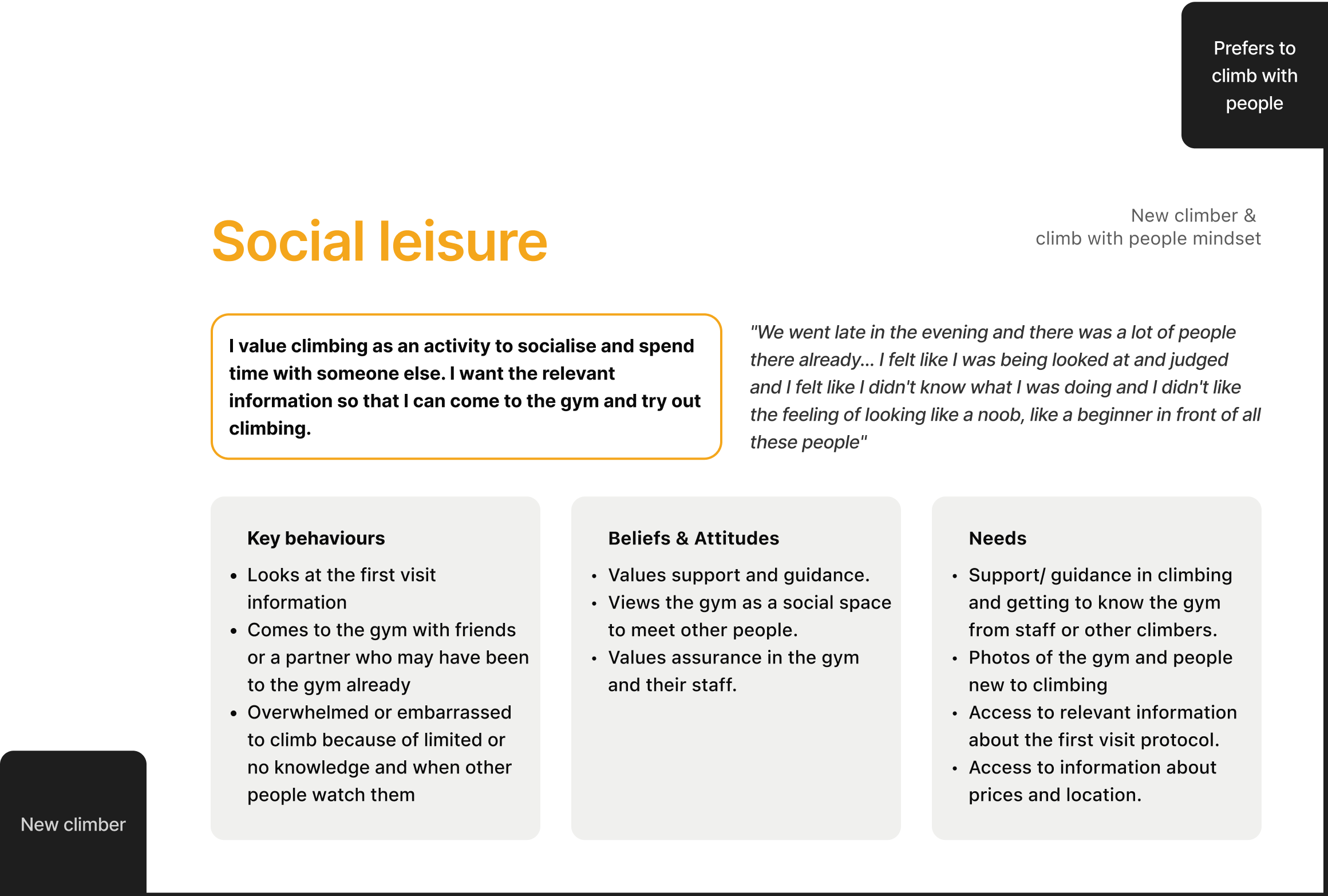
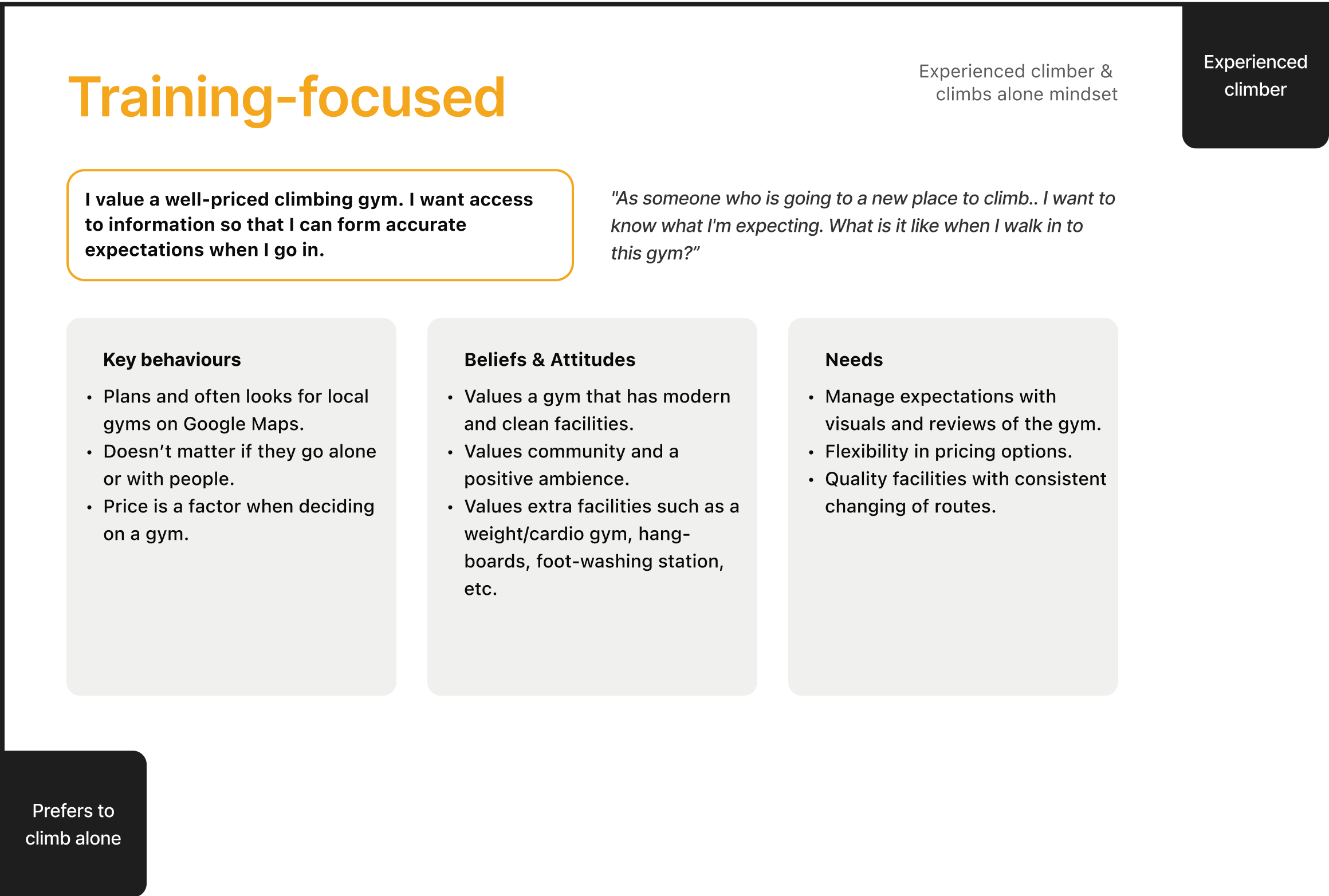
New climbers are likely to have a ‘social leisure’ mindset
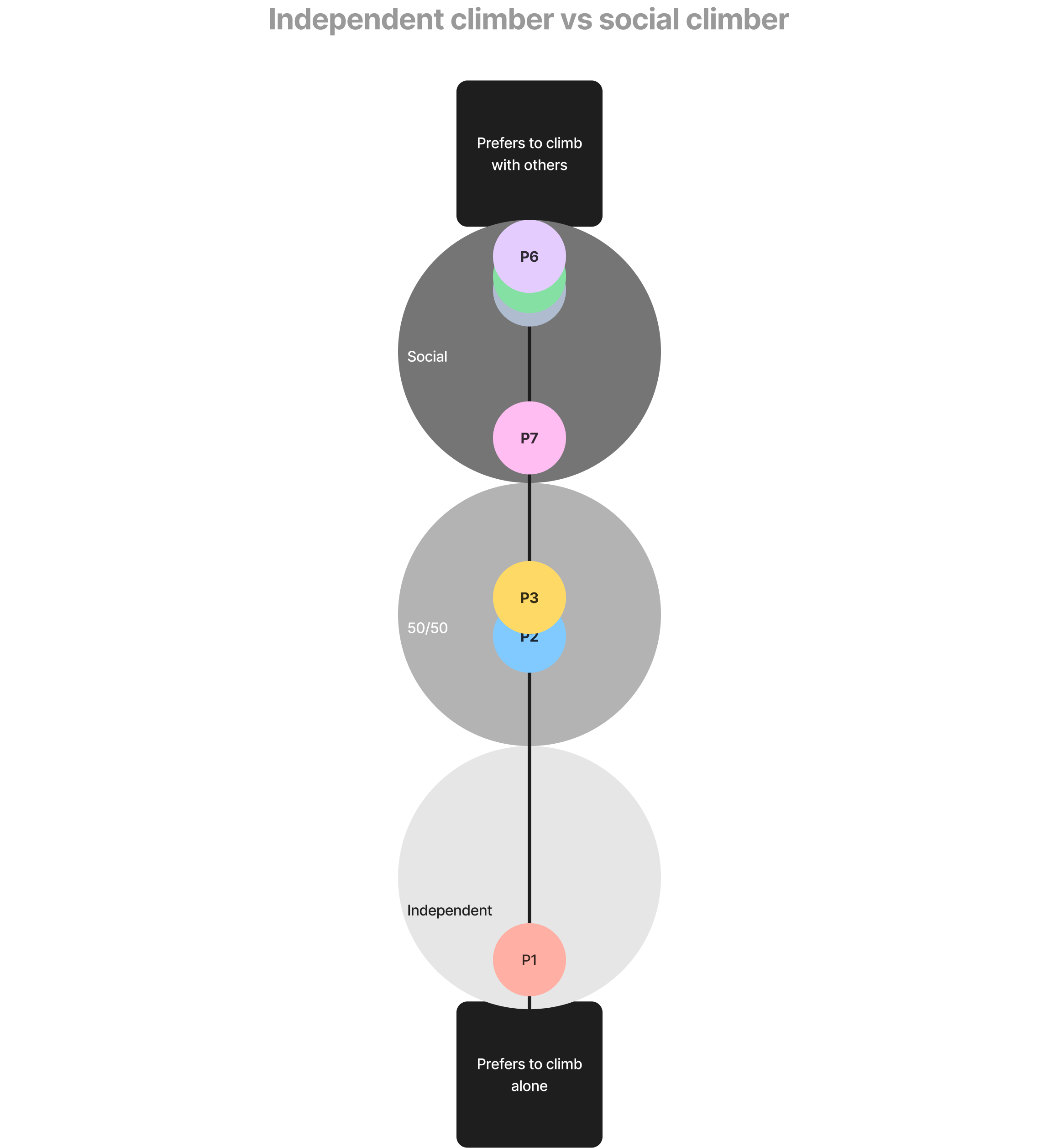
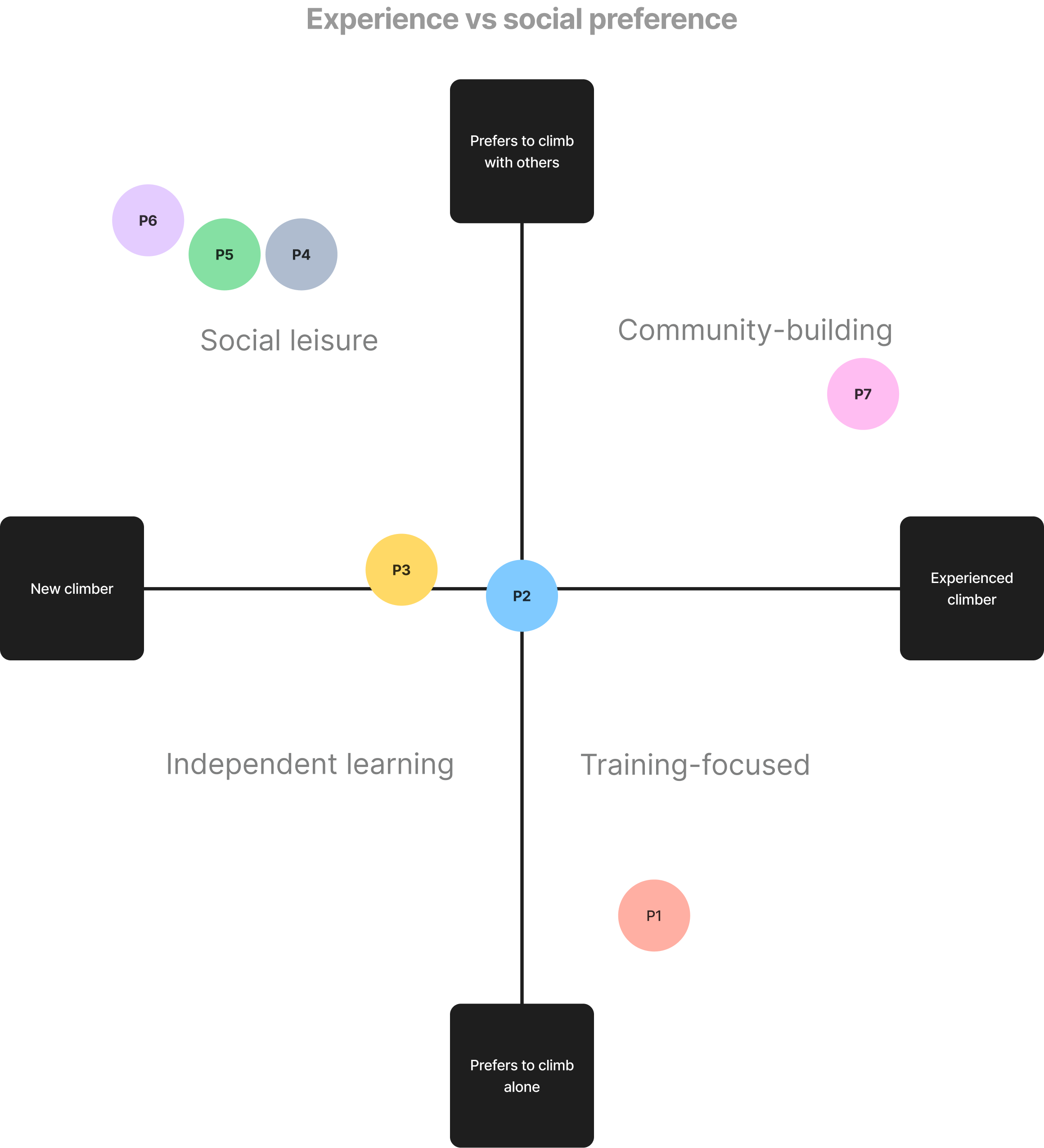
People looking for a climbing gym have specific behaviours, needs, and values based on their current mindset. Their mindset is determined by where they fall in the spectrum of new climber vs experienced climber, and the preference to climb with others vs alone.
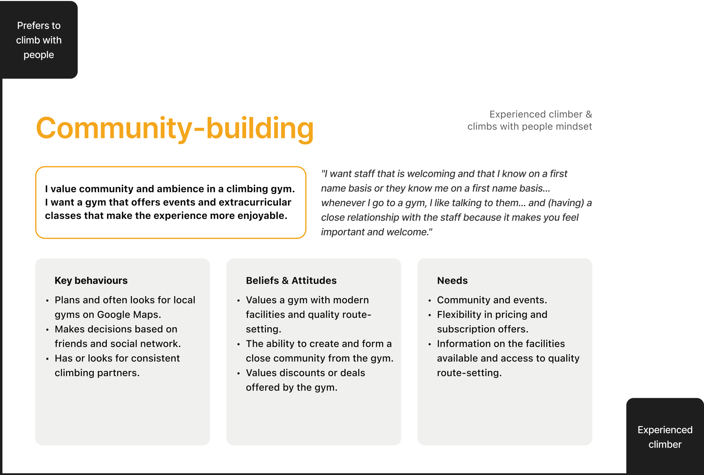
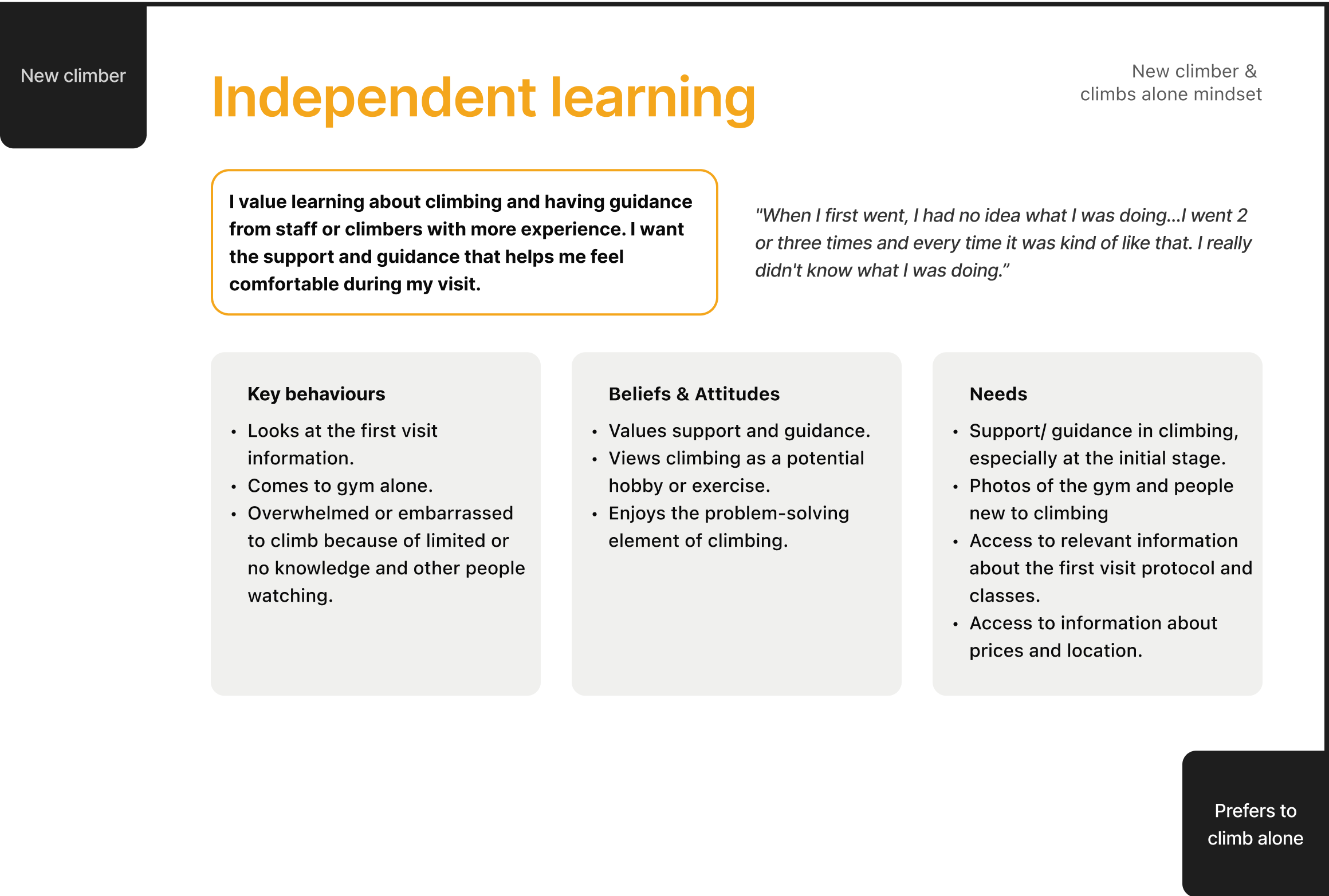
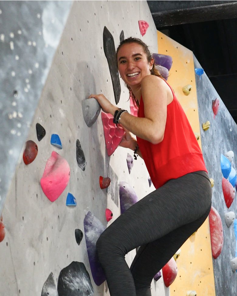
Interview participants were plotted onto the mindset matrices to understand trends and patterns. Most people new to climbing are likely to have a ‘social leisure’ mindset, valuing climbing as an activity to socialize and spend-time with friends/family, while progressing their climbing skills and receiving support from within their climbing circle.

HMW statement
In order to drive direction in the ideation phase, a ‘How Might We’ statement was created based on the research conclusion that people looking for a climbing gym have specific behaviours, needs, and values based on their climbing experience and social preference. The emphasis was placed on those new to climbing to align with Adamanta’s business strategy.
How might we create a welcoming, inviting and encouraging online experience catered towards people new to climbing to try out Adamanta?
IDEATION
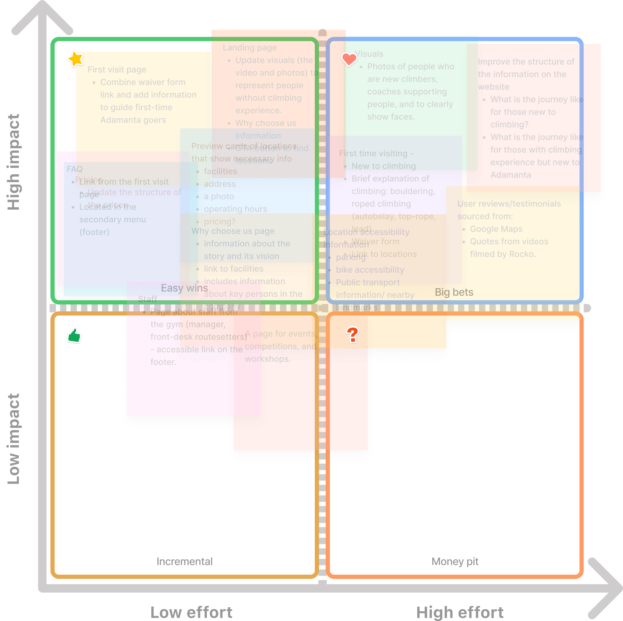
Impact vs effort matrix
Redesign emphasis on those new to climbing
Ideas were brainstormed in collaborative session with a key stakeholder. These ideas were then mapped onto an impact vs effort matrix to determine priority. The redesign will focus on an informational journey when someone visits adamanta.mx. Prior to brainstorming, business and user goals were reviewed to ensure ideas aligned with the project scope.
Key business goals include:
Increase in client satisfaction (positive first impression and general customer experience);
Recognition of Adamanta’s image of having an inclusive community, and;
Improving brand trust.
Key user goals include:
Access to key information such as pricing, location, facilities, and classes;
Manage expectations of culture, atmosphere, and gym space through visuals and digital presence;
First visit protocols, especially for those new to climbing.
While classes and events were an important factor among those with climbing experience when deciding on a climbing gym, it was agreed that it would be prioritized at a later stage of the product development cycle due to limitations on resources and time.
Sitemap
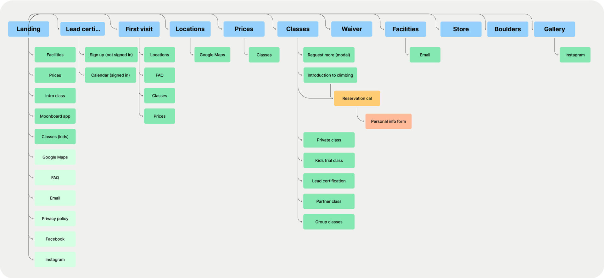
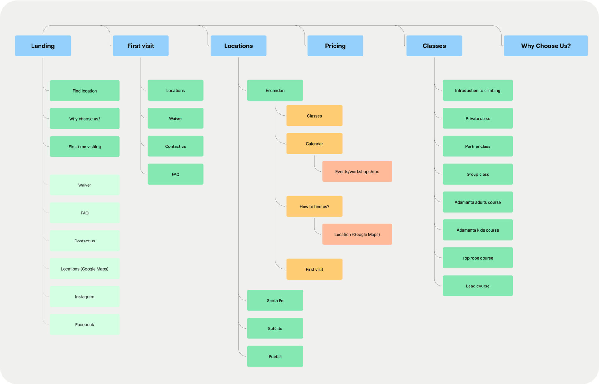
Simplifying the navigation
Excessive options on the top navigation, including some dead links, were removed from the existing website navigation in order to simplify it. This makes it easier and faster to find relevant information, avoiding the lost in a maze feeling. It was important that information was organized and easy to find as informational needs depend on user mindsets.
Existing:
Redesign:
DESIGN
Low-fidelity wireframes
Finding an Adamanta location
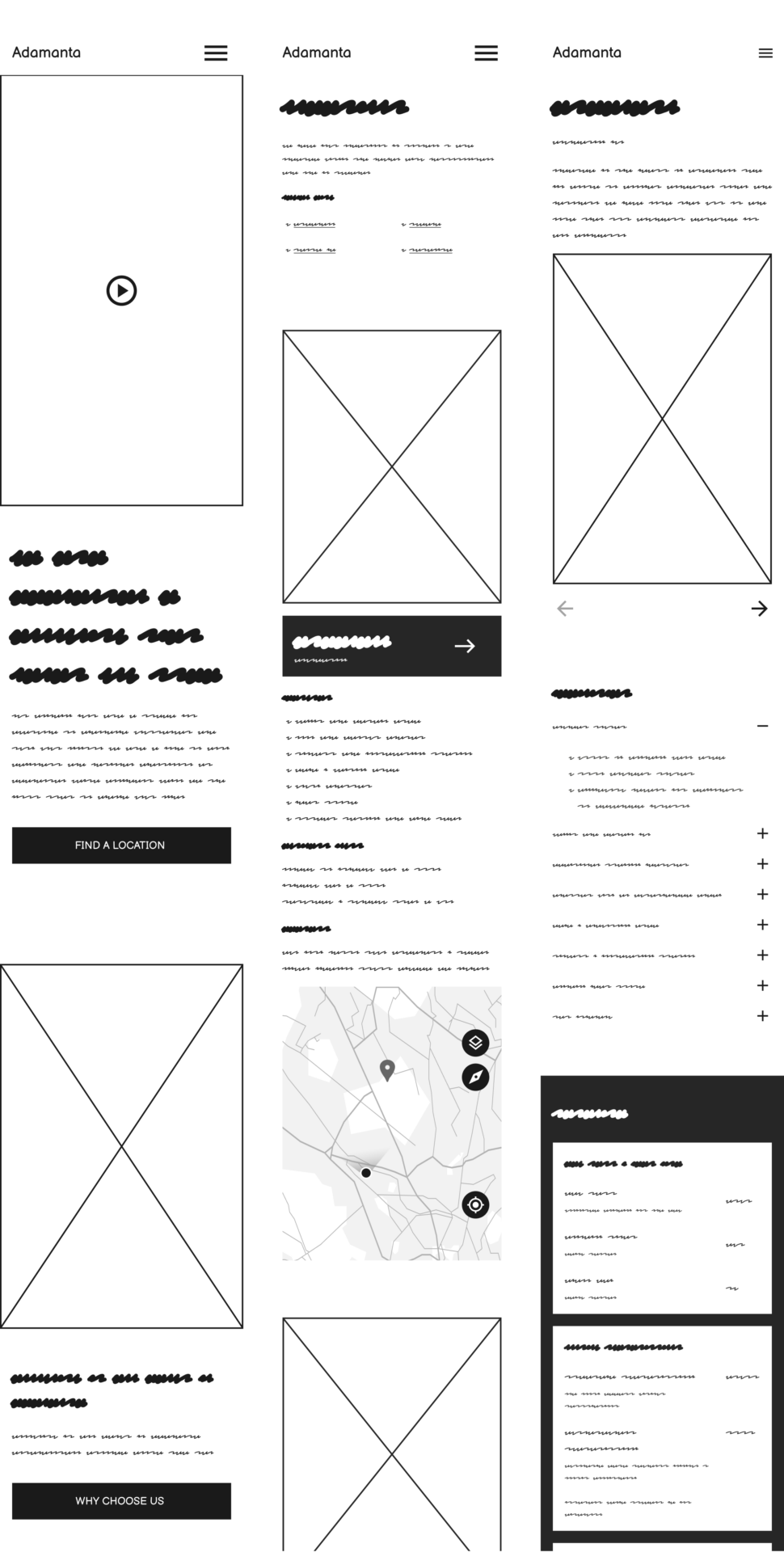
Since Adamanta is a multi-location gym and all interview participants had considered location as a top priority when deciding on a gym, it was important to make accessing an Adamanta location a top priority.
In the Location page, there are cards that offer brief details of the facilities, opening hours, address, map location, and photos of the gym.
Finding an Adamanta location wireframe example:
Landing ⟶ Locations ⟶ Escandón (location name)

Finding first visit information
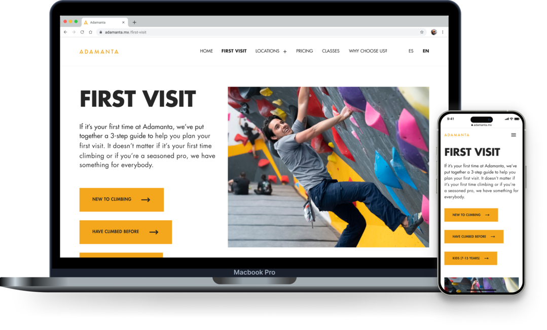
The ‘First visit’ information is crucial as it gives actionable steps to people considering coming into one of Adamanta’s gyms. It’s structured into a three step process:
1. Find location
2. Sign waiver
3. Come in/ contact us (for further queries)
This aims to simplify the first visit process and reduce any overwhelming emotions by creating a welcoming space for new climbers and realistic expectations.
Finding ‘First visit’ wireframe example:
Landing ⟶ First visit
Early design iterations
After design consultations for feedback for the low-fidelity designs, some key iterations were made on the designs. Below were the three major iterations:
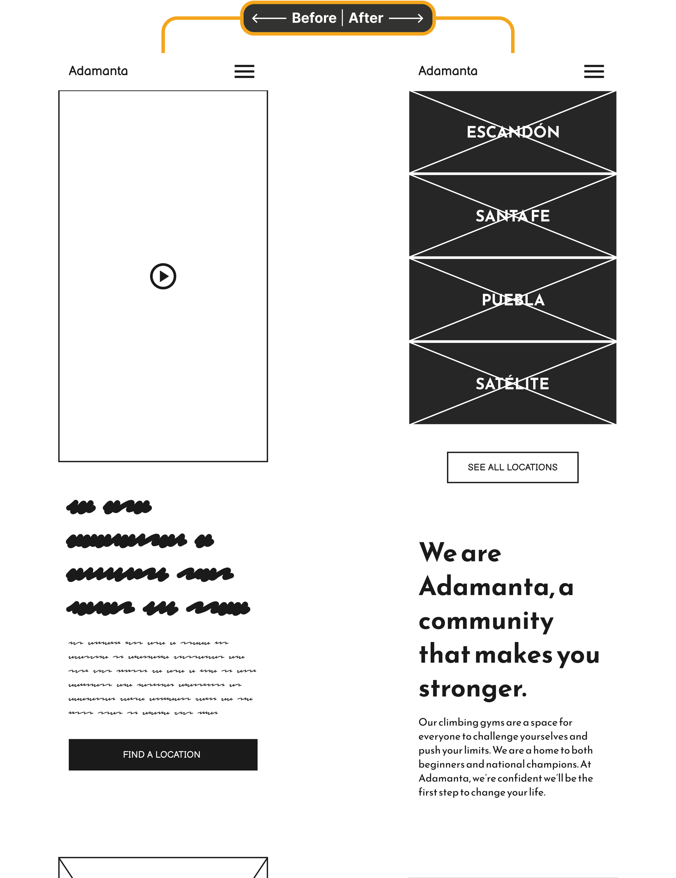
Adding location cards at the top of the landing screen
Given that one of the main priorities of both returning and new clients is accessing information related to a specific Adamanta gym and that prospective clients already know where they’d like to attend, it was decided to prioritise the first screen of the landing page with location cards.
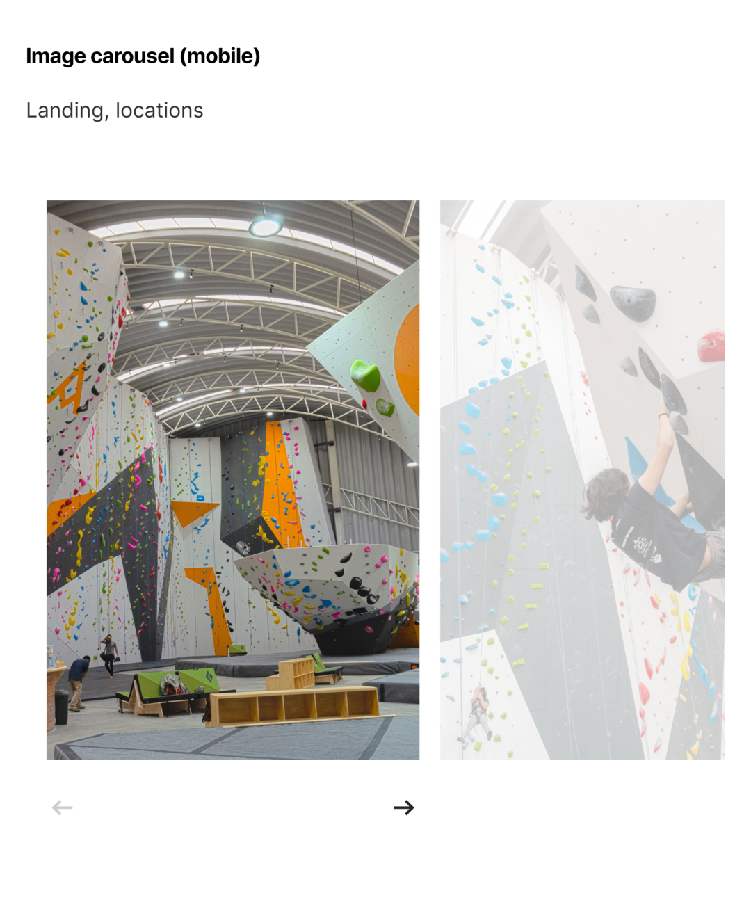
These location cards consist of a wide-angle image of the location and the name. Aside from being able to access information relating to a specific location quickly, this also provides a quick snapshot of how different locations look and compare from the landing page.
Adding content specific to client profiles to first visit page
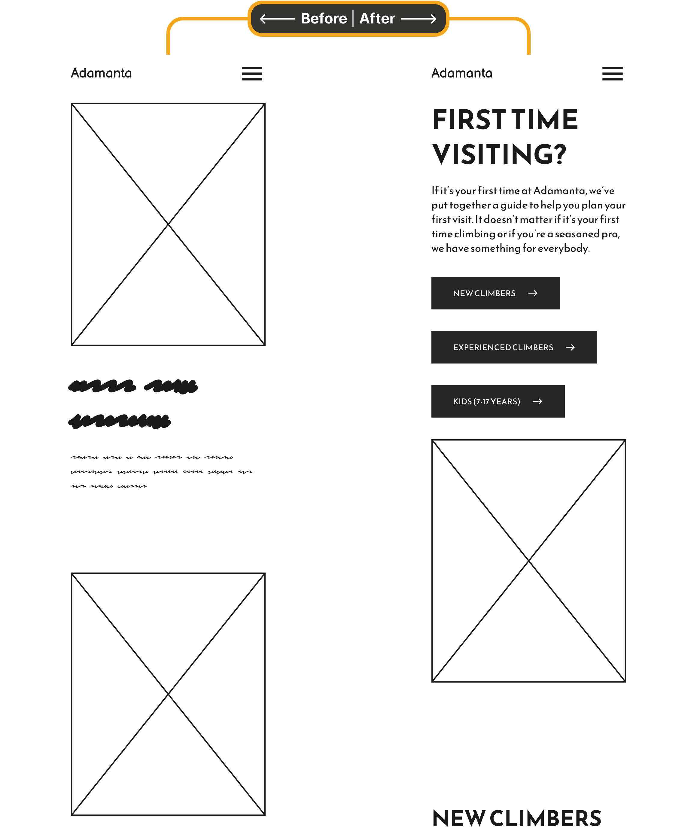
In order to cater for specific user profiles (new climbers, experienced, and kids), information unique to each group were included in the first visit page. To make the navigation easier, buttons indicating to each client profile were added to the top of the first visit page.
While the three-step process is the same structure for all users, the content is unique to each profile. This creates an experience that makes prospective clients feel welcome and is true to Adamanta’s image of an inclusive community.
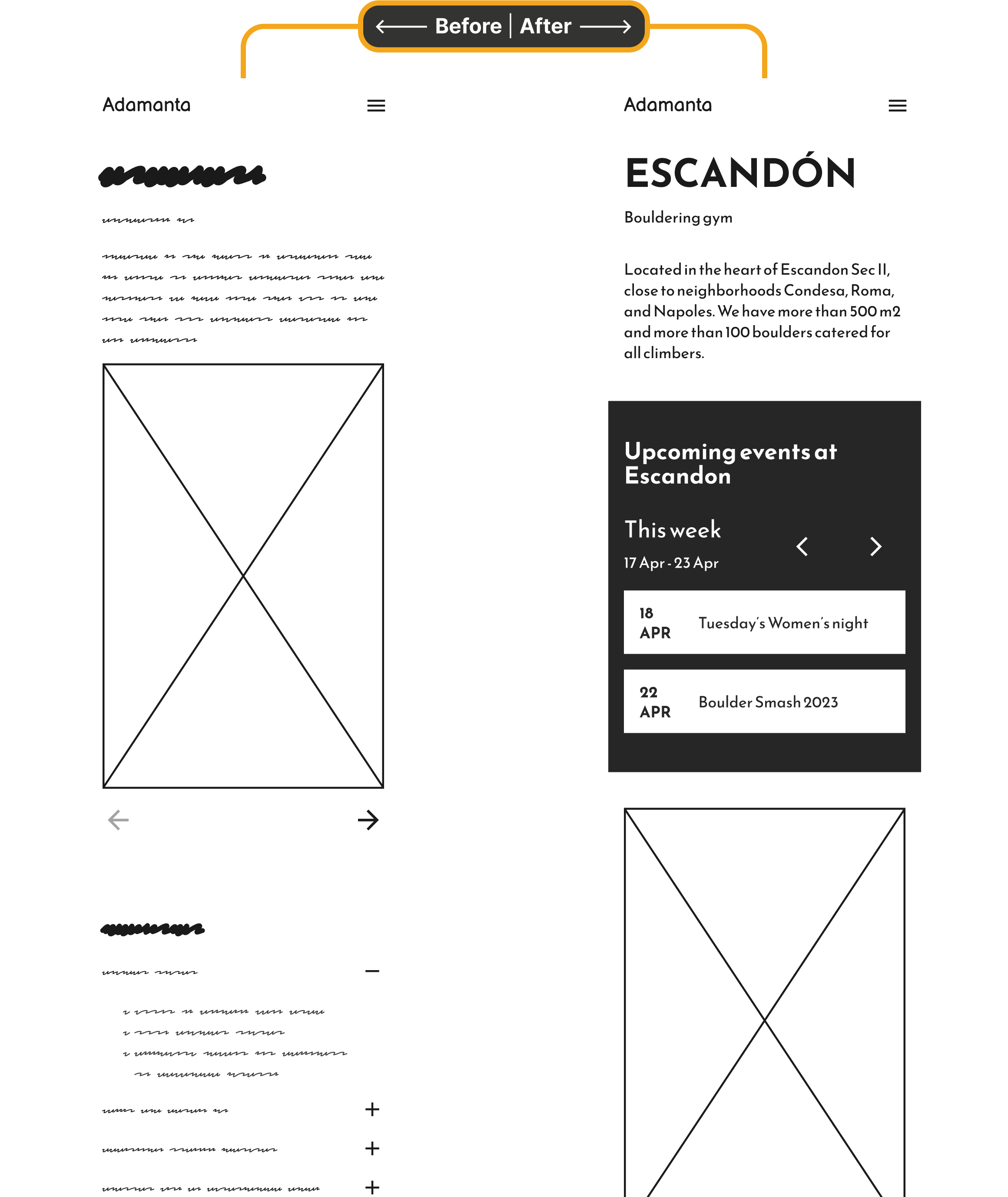
Prioritizing calendar on individual locations page
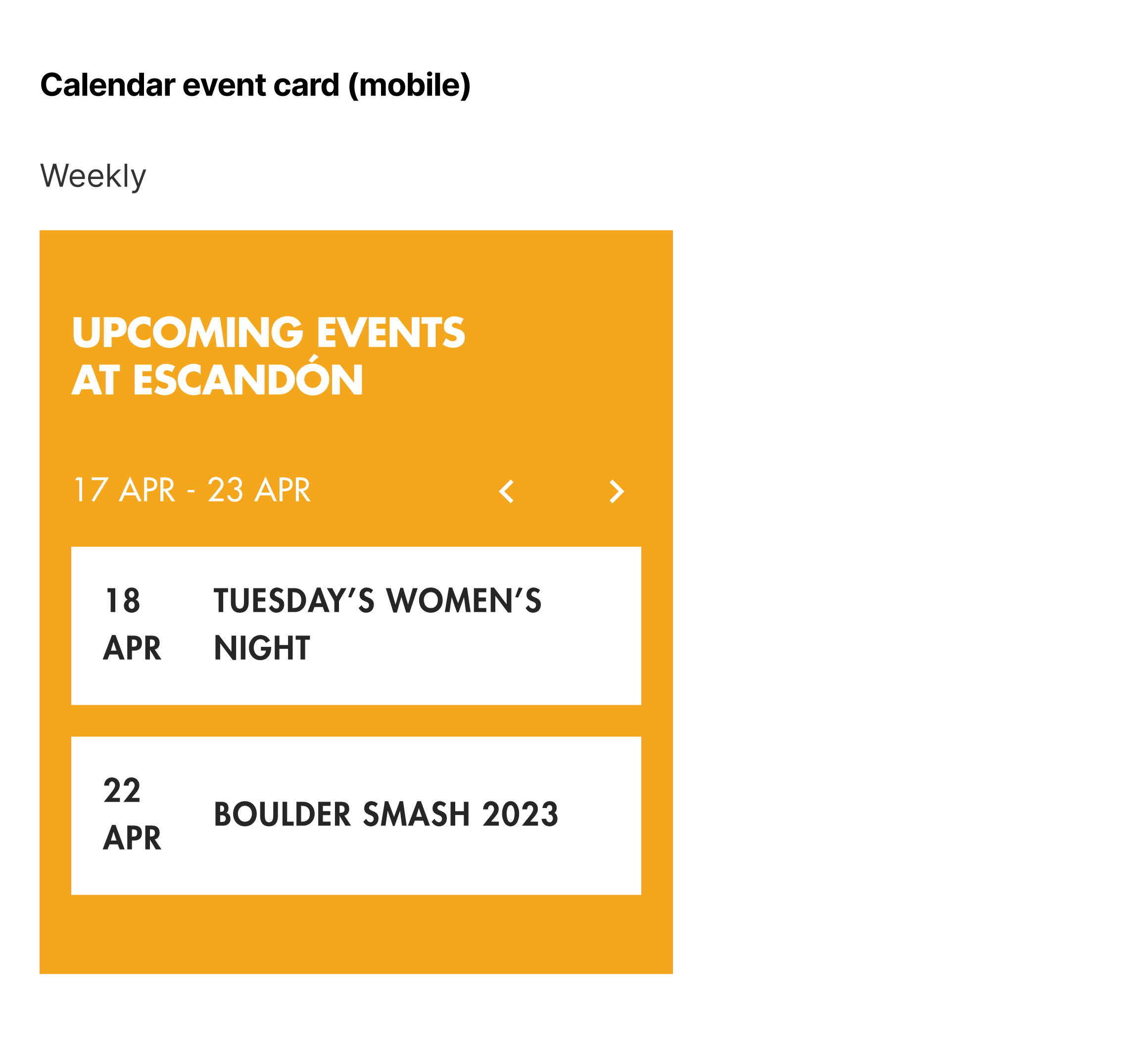
Prioritizing a weekly calendar snapshot on each location page conveys that the gym is active, a sense of community, and gives a reason for users to visit the site recurringly (at the moment, events are posted on Instagram only).
Research also indicated that those in the ‘community-building’ and ‘social leisure’ mindsets prefer a gym with social events or opportunities to socialize.
UI style guide
Creating a more intuitive and pleasant experience
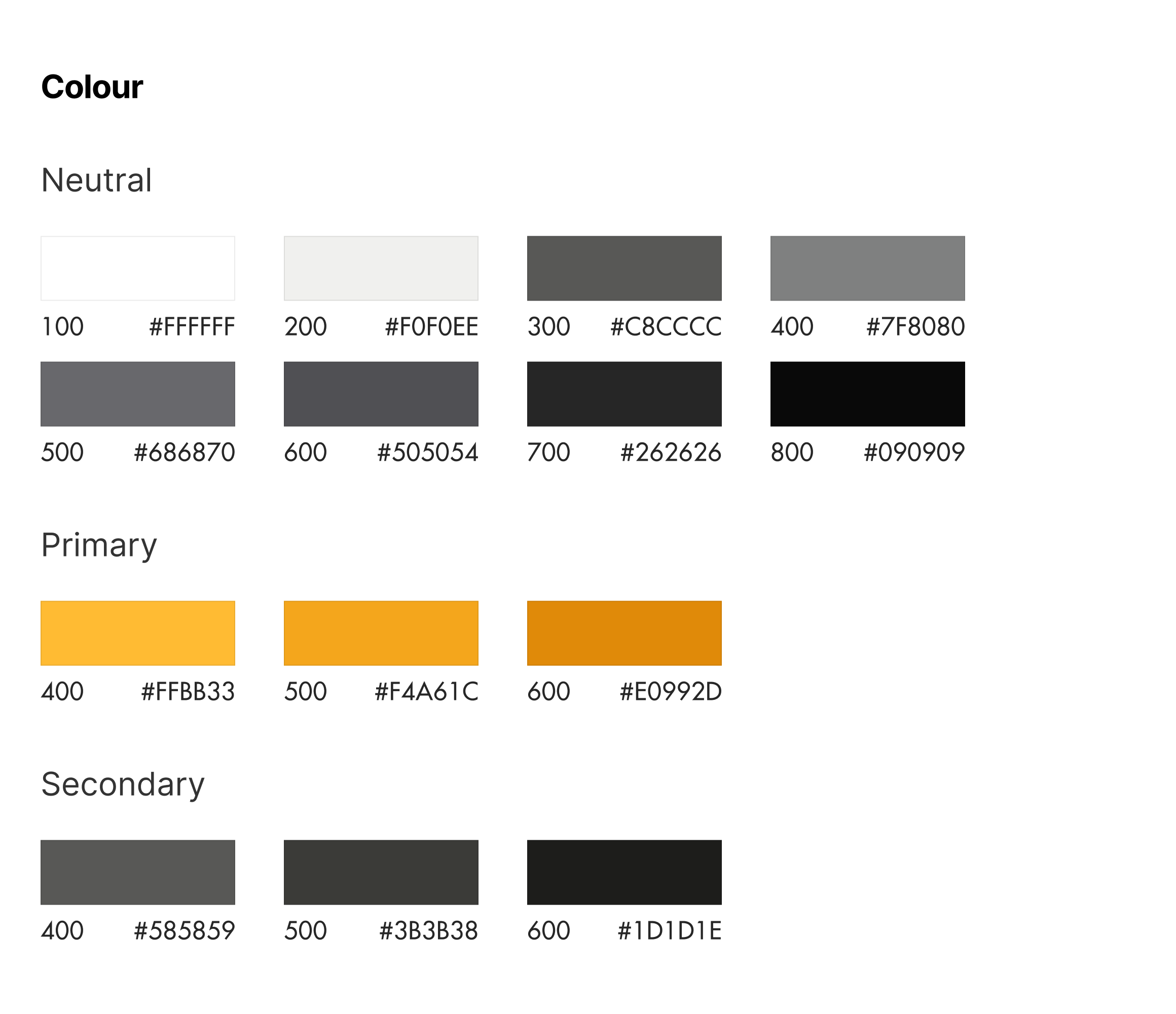
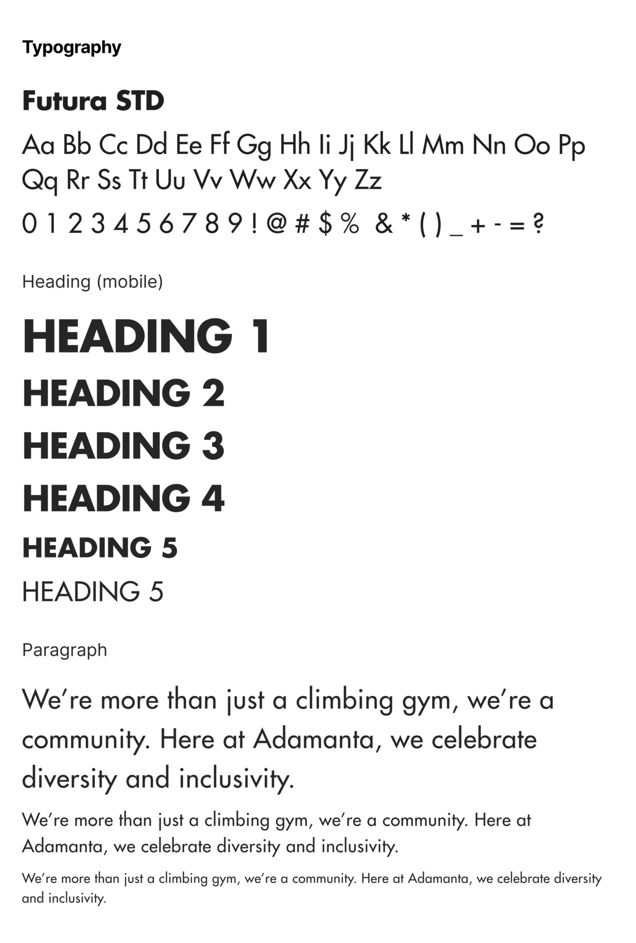
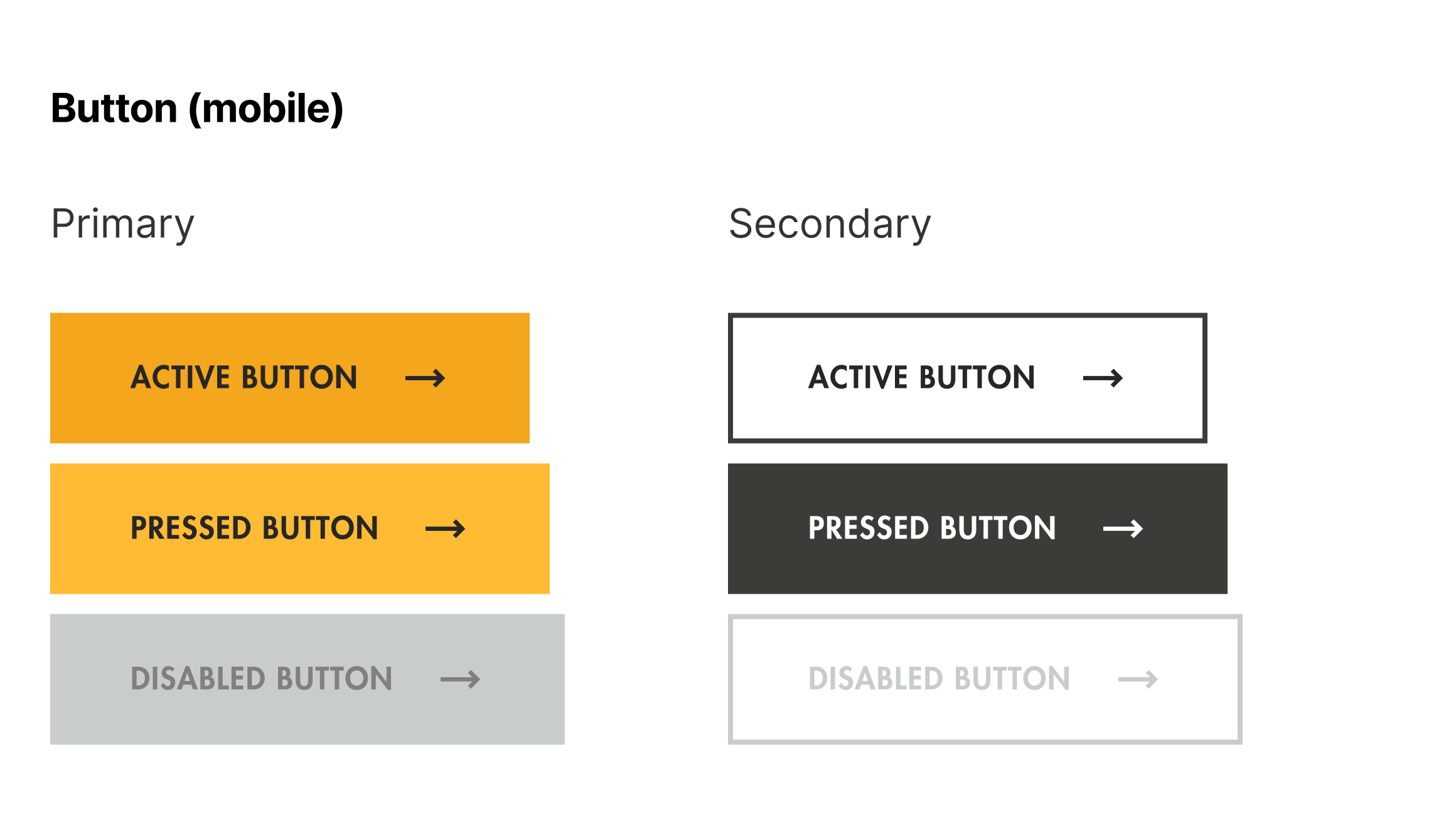
Based on Adamanta’s existing visual branding, the UI style guide employs many sharp, rigid, yet clean forms. This is also consistent to the illustrative designs on the walls at Adamanta, the logo, and the existing typography choice (Futura STD). The main intention behind the UI was to create a minimal and complimenting experience to the large amount of information and to make the experience as pleasant as possible.
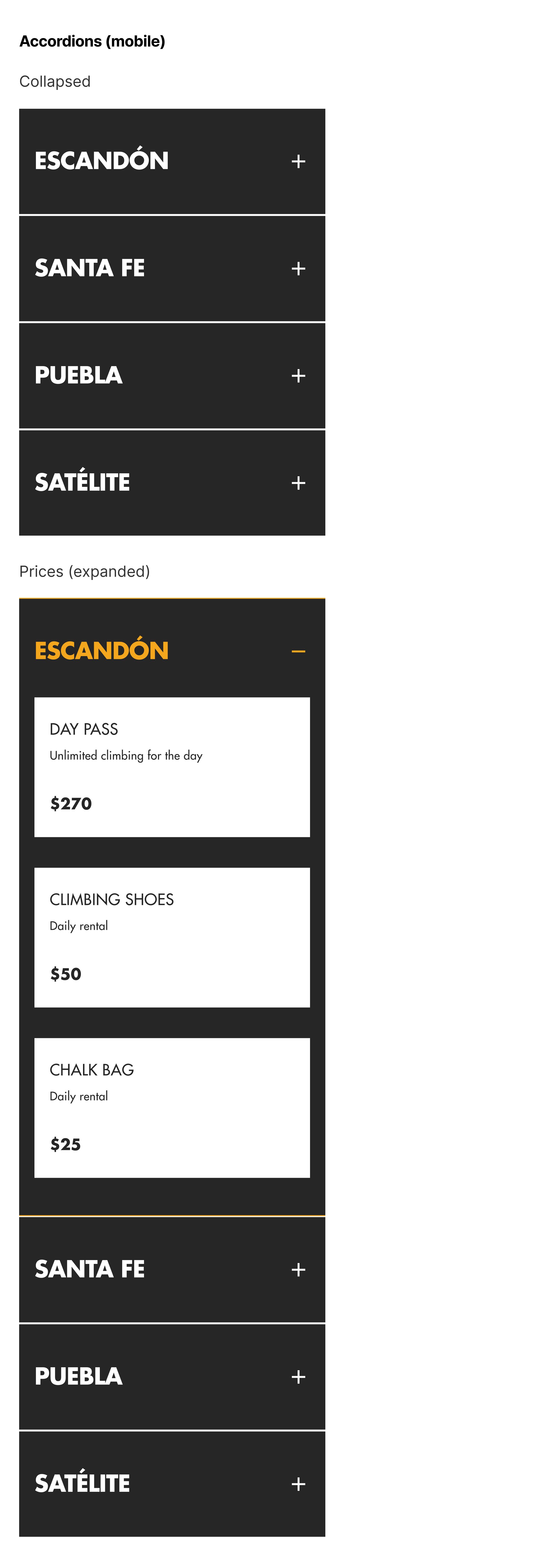
The use of accordions and image carousels help users to browse the large amount of information intuitively and in an empowering manner.
The use of the primary yellow (the same colour on the logo) for accentuated text gives a nice contrast throughout the website that aligns with Adamanta’s primary branding colour.
High-fidelity designs
From mid-fidelity, hi-fidelity designs for both desktop and mobile viewports were done in preparation for usability testing and stakeholder feedback.
Landing (mobile)

Landing page
From the landing page, new users can go to a specific location page through one of the location cards at the very top, watch a video of Adamanta that showcases their gym spaces and inclusive culture of community, or learn about the different styles of climbing that is offered at Adamanta’s gyms. The idea is to give a brief, yet positive first impression of the Adamanta brand.
Tha landing page also acts as the foundation to conveniently access other parts of the website such as pricing, classes, first visit information, and why choose us information using the top navigation or links throughout the landing page.
Escandón - location (desktop)

Escandón - location (mobile)

Escandón page (location)
Escandón is one of Adamanta’s locations. Having a dedicated page to each location means accessing key information related to a location, such as the facilities offered, pricing, general location details, and details of the crew/personnel working there, is easier and more convenient.
The weekly calendar snapshot of events is located at the top of the page for returning and new visitors to view, providing social opportunities for those who have a social mindset.
First visit (desktop)

First visit (mobile)

First visit page
For those who are new to Adamanta, the first visit page caters to visitor’s profile - new to climbing, with experience, or kids. Information, both visual and written, is unique to each profile.
Content from the FAQ section were derived from the research process and intends to resolve common doubts visitors may have.
Why choose us? (desktop)

Why choose us? (mobile)

'Why choose us?' page
The research stated that many people new to climbing often feel intimidated in joining a climbing gym. It was also discovered that many people loved going to Adamanta because of its warm and friendly community.
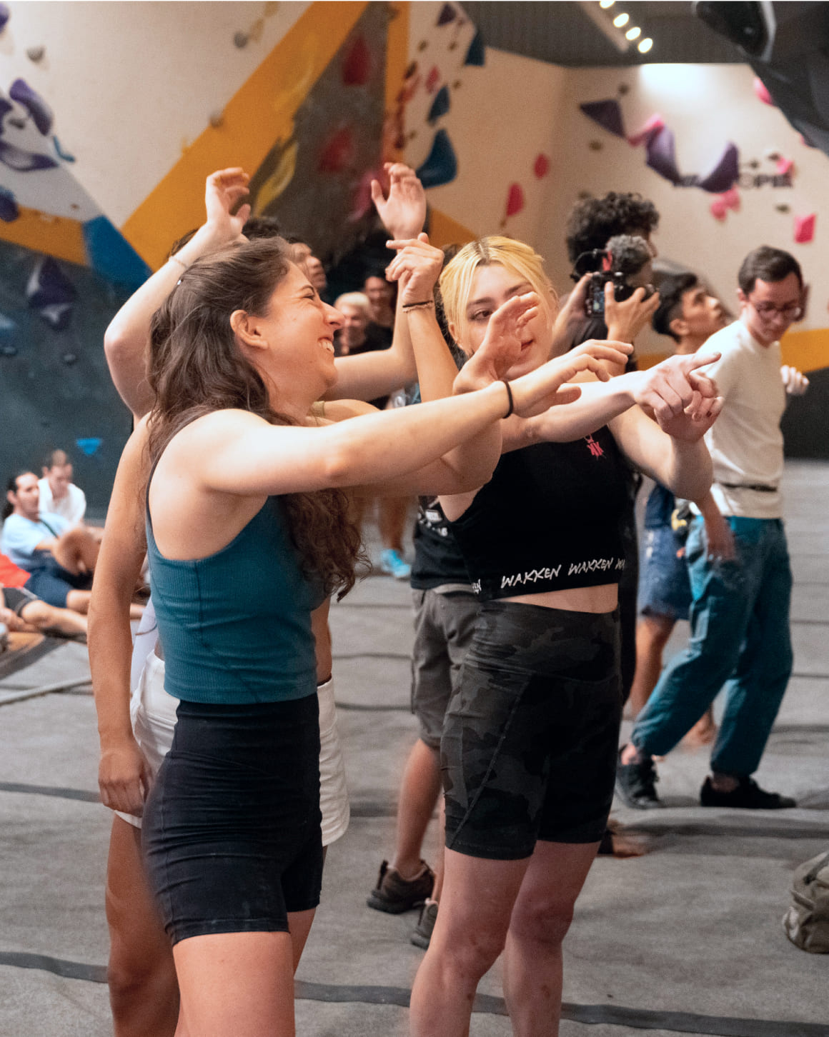
The use of visual media was designed to show the very best of Adamanta’s culture of an inclusive community. This means showing the community enjoying themselves with a particular emphasis on showing people’s faces in positive emotion states. It was also important to show of all backgrounds, particularly those that people new to climbing (i.e., not super fit). This creates an experience where visitors can feel welcome, more likely to come into an Adamanta gym, and be part of the community.
TESTING & ITERATION
Usability testing
 6/6 find the visuals impactful & valuable
Usability tests were done to determine design inconsistencies and usability problem areas within the redesigned website. Participants were also asked of their impressions of Adamanta and if they would try out one of their gyms after browsing through the redesigned website.
Three key tasks were tested with a total of six participants in the following order:
Find where the Escandón gym is located;
Find the prices for the Escandón gym;
Find relevant information for your first visit to an Adamanta gym.
Usability Testing Insights
 6/6 had a positive impression of Adamanta and would try out one of their locations.
 6/6 found the visuals impactful & valuable.
 6/6 found accessing location and pricing information was easy and intuitive.
 6/6 found it difficult to navigate through the Escandón page.
 5/6 had doubt clicking on or did not identify with the profiles when presented with either 'New climbers' or 'Experienced climbers' on the ‘First visit’ page.
 3/6 didn't notice there was specific information related to the first visit.
“It transmits an essence that it’s a place with a soul because it shows a lot of warmth. It tries to convey that it’s a safe and comfortable place, with good people, that it’s a place where you’re going to enjoy and have a great time.”
- Usability participant after reviewing the website. The original quote is in Spanish.
Design iterations
Observations and notes from the usability tests were synthesized, affinity mapped, and organized onto a severity vs frequency matrix to determine priority design iterations. A complete analysis on the usability testing data can be found here.
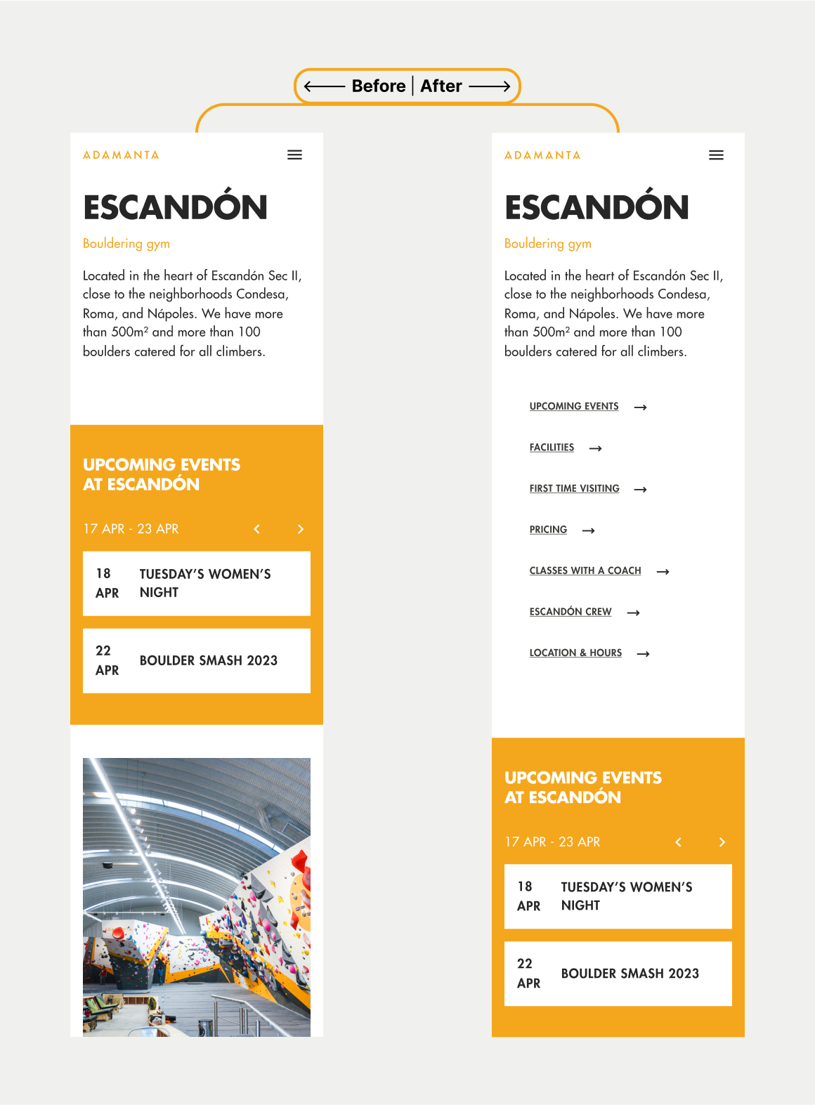
Improving the navigational experience
 Added shortcut links on the top of the page so users can expect what content will be displayed on the page and access these sections conveniently.

 Moved the position of the section ‘First time visiting’ further up in the page so users are likely to interact with it whilst scrolling.
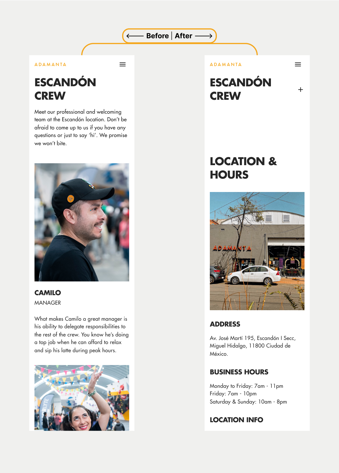
 Adjusted the section ‘Escandón crew’ to be expandable and collapsable (accordion design) to save scrolling real-estate
Reducing uncertainty with user profiles
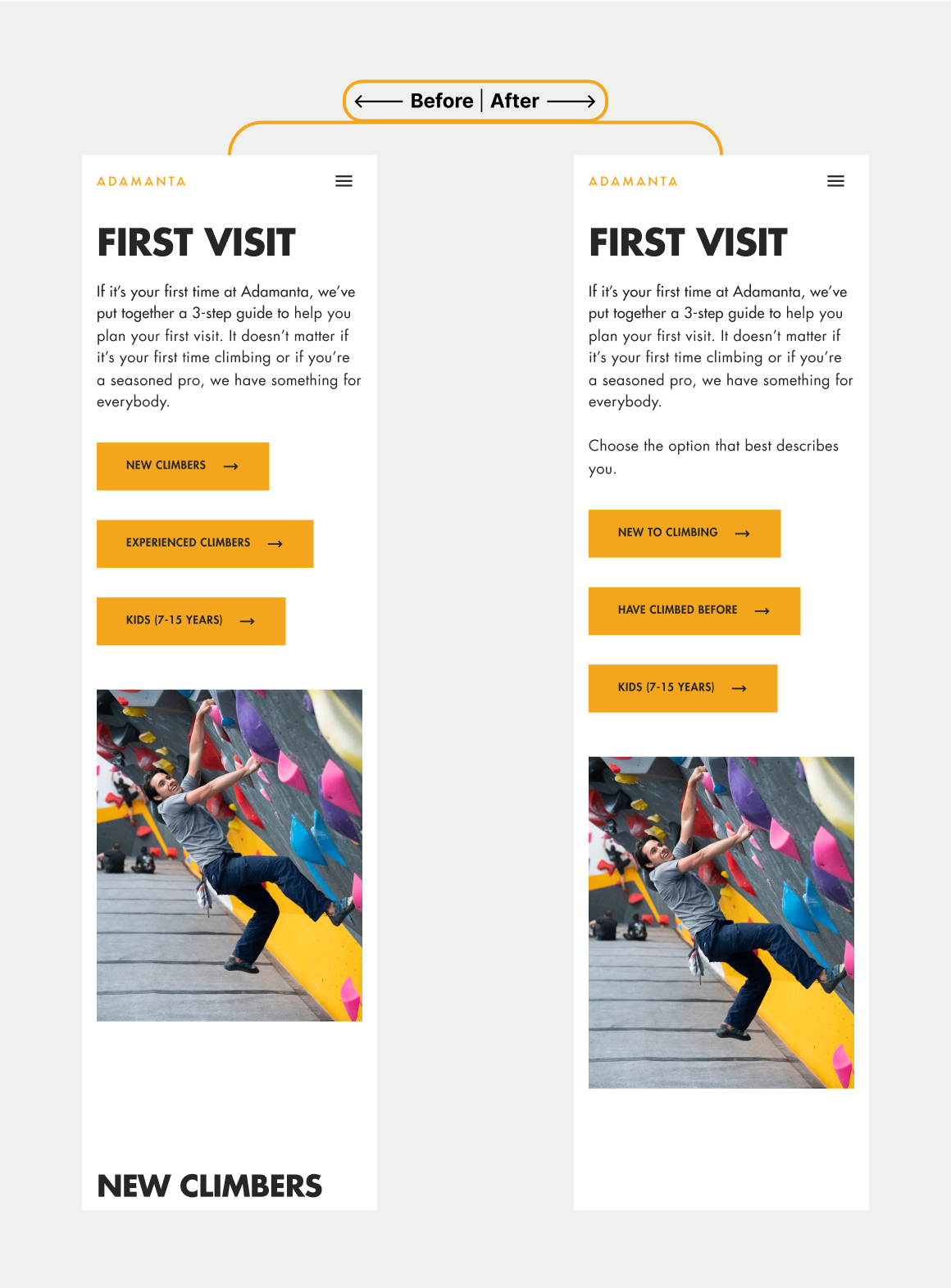
 Changed the label names of the profiles:
‘New climbers’ to ‘New to climbing;
‘Experienced climbers’ to ‘Have climbed before’.
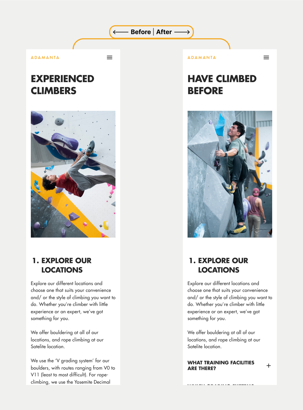
 Changed the photo in the ‘Experienced climbers’ section to a photo of a climber that is not perceived as intimidating.
REDESIGN
↱ Before
↱ After
Before vs after
Finding an Adamanta location easier
Find and navigate the Adamanta location you want to go to and access to the necessary information such as photos, details on facilities, pricing, upcoming events, and getting to know the friendly staff.
Creating a welcoming space for newcomers
Whether you’ve climbed before or it’s your first day, everyone is welcome to Adamanta. Adamanta.mx aims to form a positive first impression by attending to your unique needs.
↱ Before
↱ After
↱ Before
↱ After
Navigating pricing more intuitively
Navigate pricing easier with a simple and minimal user interface so you feel in control of what you want to see. The use of accordions help to separate the different day prices as per location.
Showcasing Adamanta’s inclusive and warm community
Adamanta’s strength comes from its culture of an inclusive and warm community. The visuals and style of copy help to transmit the atmosphere you can expect when coming into an Adamanta gym.
↱ Before
↱ After
 The first step was to look into the google reviews of each Adamanta location to discover common positive and negative themes. On average, Adamanta’s gyms had a 4.8/5 rating.
 Website mentions an introduction for people new to climbing, but reviews mentioned clients were told there were no introduction when they went to the gym.
 Added shortcut links on the top of the page so users can expect what content will be displayed on the page and access these sections conveniently.